




Most Shopify campaign traffic is lost on pages that ask the visitor to do several things at once. A landing page earns its lift by what you remove, not what you add.
A Shopify landing page is a standalone page built for one campaign and one action. This guide covers what separates it from a regular Shopify page, the six landing page types worth building, 5 real Shopify landing page examples, the templates you can start from, and five optimization fixes — updated for 2026. If you want the click-by-click build instead, our dedicated guide on how to build a Shopify landing page that converts walks through it end to end.
要点
- A landing page differs from a regular Shopify page on seven dimensions: purpose, navigation, content focus, number of CTAs, traffic source, customization and how it is measured.
- Six types cover almost every campaign — splash, lead generation, sales, thank you, seasonal and webinar registration pages.
- There are three build routes: Shopify’s built-in pages and theme templates (free, limited design), custom Liquid (developer required), or a page builder such as PageFly (drag-and-drop, template library).
- The five store examples below — Skin Discovery, Shopify’s own free-trial page, Flow, Luxy Hair and Monk Manual — each win on one thing: a single legible value proposition, one repeated CTA, or a quiz that narrows choice instead of a variant grid.
- PageFly’s free plan covers 1 published page or section, 10 AI credits a month and access to 320+ page & section templates; paid plans start at $24/month (Builder).
What is a Shopify landing page?
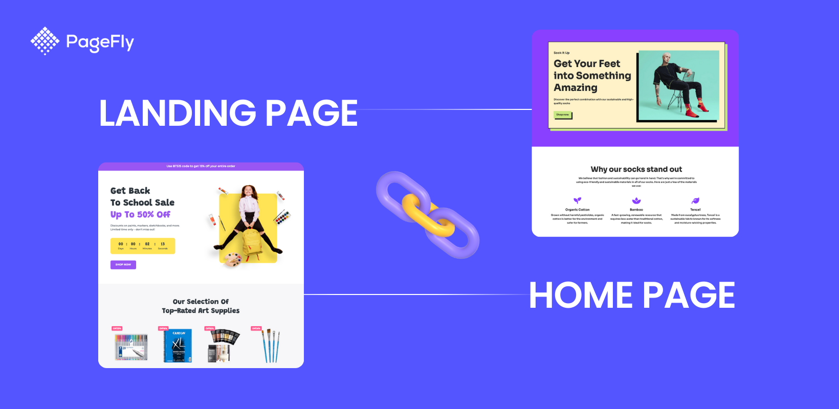
A Shopify landing page is a standalone page on your store built around a single campaign and a single action — buy this product, claim this discount, join this list — with the elements that normally help people browse deliberately stripped out. Unlike a regular Shopify page (homepage, product page, collection page), which serves several purposes at once and encourages exploration, a landing page keeps one primary call-to-action and removes the competing paths away from it. You can build one with Shopify’s native page editor and theme sections, with Liquid code, or with PageFly, a Shopify page builder that adds drag-and-drop layout control and a template library on top of your existing theme.
Why Shopify Landing Pages Drive Higher Conversions
Shopify landing pages deliver superior results because they address four critical success factors that merchants care most about:
Speed & Performance
- Far fewer sections and third-party scripts than a full homepage, so there is less to load before the offer appears
- A single-column mobile layout keeps the offer and the button in view without pinch-zooming
- Hosted on Shopify’s own infrastructure, so the page inherits your store’s hosting and CDN
モバイル・ファースト・デザイン
- Responsive layouts adapt to any screen size automatically
- Touch-friendly buttons and forms reduce friction on mobile devices
- Progressive web app capabilities for app-like mobile experience
Conversion-Focused Design
- Single-purpose focus eliminates distractions that cause visitor confusion
- Trust signals (reviews, security badges, guarantees) sit next to the button instead of in a separate section
- Small enough to test properly — see how Shopify A/B testing works before you change the headline
ROI & Measurable Results
- Track one specific conversion goal (purchase, signup, download) against your store’s conversion rate
- Integration with Shopify analytics and Google Analytics 4
- Cost-effective compared to paid advertising (organic traffic + high conversion rates)
Shopify Landing Page vs Regular Shopify Page: Key Differences
Understanding the difference between landing pages and regular Shopify pages is crucial for your marketing strategy:
| アスペクト | ランディングページ | Regular Shopify Page |
|---|---|---|
| 目的 | Single conversion goal (signup, purchase, download) | Multiple purposes (browse, learn, explore) |
| ナビゲーション | Minimal or no navigation menu | Full navigation menu and footer |
| Content Focus | One specific offer or product | Various products, information, links |
| Call-to-Action | One primary CTA repeated strategically | Multiple CTAs for different actions |
| Traffic Source | Targeted campaigns (ads, email) | Organic search, direct traffic, general browsing |
| カスタマイズ | Highly customized for each campaign | Consistent template across site |
| Measurement | One conversion goal, tracked per campaign | Traffic, engagement and assisted conversions across the funnel |
In simple terms: Regular Shopify pages help visitors explore your store, while landing pages convert them into customers or leads. That is why your homepage and your product pages should keep their navigation — exploration is their job.
Resist the urge to compare the two on a generic “average landing page conversion rate” figure. Benchmark against your own store instead: our breakdown of the average Shopify conversion rate and how to improve it is a more useful baseline than a number pulled from another industry.
Shopify landing page examples: what each one gets right
Five real Shopify landing pages are pulled apart in detail further down this page, plus two ready-made PageFly templates. Here is the one-line version of what each one gets right, so you can jump to whichever is closest to your campaign.
- Skin Discovery Rewards (built with PageFly) — leads with the reward rather than the brand story: the value proposition is legible in one screen and the SIGN UP button is effectively the only action available.
- Shopify’s own free-trial page — one CTA, used twice: once in the hero for people who are already sold, once after the value proposition for people who needed convincing.
- Flow — seasonal pages built around genuinely useful beekeeping content, with a location-aware header bar so the offer matches where the visitor actually is.
- Luxy Hair — replaces a variant grid with a quiz, so the shopper is narrowed to one product instead of being asked to compare all of them.
- Monk Manual — turns a thank you page into a referral engine by drawing the entire milestone ladder on the page.
- Cookie Easter and SmartNest Mother’s Day (PageFly templates) — both do the seasonal job the same way: themed art, a countdown, one discount, nothing else competing for the click.
One honest distinction worth making: five of those are live stores you can study, and two are templates you can install and edit today. If you want inspiration beyond landing pages specifically, our roundup of the best Shopify store examples and our gallery of PageFly product pages cover the page types that carry the rest of your traffic.
Shopifyランディングページの種類
Shopify landing pages are versatile tools designed to guide visitors toward specific actions, such as making a purchase or signing up for a newsletter. Each type serves a distinct purpose in the funnel. Below is an in-depth look at the six most common types, with tips and real-world examples — and if you want broader inspiration, our roundup of the best Shopify store examples covers whole stores rather than single pages.
Splash Landing Pages
Splash pages are visually striking pages used for announcements or age verification. They include minimal copy, bold visuals, and catchy messaging to create a strong first impression — export the artwork at the right dimensions first, using our Shopify banner size cheat sheet.
スプラッシュ・ランディングページは、最小限のコピー、強力なビジュアル、キャッチーなメッセージを含み、瞬時にユーザーに強い印象を与えます。スプラッシュページはウェブページに先行することが多いため、マーケティングファネルのどの段階でも使用することができますが、ブランド認知度を高めるためにファネルの一番上に使用することをお勧めします。ZARAがどのようにスプラッシュページを使ってロケーションを確認したかを見てみましょう。
Key tips:
- Use a lightbox overlay: Instead of redirecting the visitor to another page, a lightbox overlay maintains them on the same page they were on when they first arrived. The translucent nature of the splash page built in the lightbox overlay method ensures that guests understand they are in the right place they expected to be.
- 訪問者を元のページに戻す:ウェブがユーザーをスプラッシュページに誘導する場合、最初にユーザーがどこから来たかを追跡しておくことが重要です。
- スプラッシュページの繰り返し表示は避けましょう:スプラッシュページを最初に表示したときにゲストがスプラッシュページを見逃すと、次にスプラッシュページを表示したときに、ゲストがあなたの望むステップに進もうとしない可能性が高くなります。
- 読み込み速度の最大化:スプラッシュページに、ページの読み込み速度を低下させる可能性のある、例えば自動再生動画で溢れさせないことが重要です。
- Make your splash page design responsive: Make sure your splash page works for every viewing device. Most themes handle this already — if yours does not, our list of the best Shopify themes flags the responsive ones.
- 終了意思表示ボタンがある:ユーザーに、ウェブサイトから退出する可能性があることを気づかせることは重要である。選択肢がないと感じて喜ぶ人はいない。スキップボタンにアクセスできることは、この問題を軽減するのに役立つ。

For example, this landing page simply allow customers to fill in location and language information to navigate them to the right sales pages. This type of landing page is useful for both navigating users and collecting users' general data for future campaigns.
Lead Generation Landing Pages
Different from a standard Shopify page with a contact form, lead generation landing pages capture visitor information through a form in exchange for an incentive such as a discount or a downloadable resource.
マーケティングファネルに話を戻すと、リードジェネレーション・ランディングページは通常ファネルの中間に位置します。強力なリードジェネレーション・ランディングページを作るには、適切なバランスを見つける必要があります。基本的に、訪問者にEメールや連絡先を残してもらうよう「お願い」するのであれば、ダウンロード可能なリソースや割引コードなどのオファーで「報いる」必要があります。

For example, this landing page from Nauto collects customer information and rewards the visitor with an eBook — one field asked for, one thing given back.
To help you easily create this type of Landing page, Shopify has built-in Contact Form and Customer form which can easily be added to your Coming soon page, Password page, or a Lead Capture page. In this example, Nauto used the Lead Generation page to collect contact information and capture leads.
- 安心感とパーソナライゼーション:商品を購入する際、何が好きで何が嫌いなのかを知るためには、訪問者を観察し、学習することが重要です。例えば、パーソナライゼーションでは、訪問者のセグメントごと、あるいは訪問者ごとに異なるページを表示することができます。
- ランディングページはシンプルに:シンプルな外観のランディングページは、訪問者がよりよくナビゲートし、必要な情報をキャッチすることができます。これは、例えば、短く甘い見出しをつけたり、フォームフィールドの数を最小限に抑えることで実現できます。
- ポップアップがおすすめです:ポップアップは、訪問者の注意を即座に引くのに最適な方法です。ページの背景をぼかし、新製品や販売キャンペーン、ニュースレターの登録など、訪問者が興味を持ちそうな情報ボックスを表示しましょう。印象的です!
- Social proof is the best ally: Showing that real customers stand behind the product helps. Star ratings and testimonials are the cheapest version of it — the same tactic that makes the best Shopify product pages work.
- ページに選ぶボタンは重要です:ボタンに何らかのメリットを加えることで、成功の可能性が高まります。ボタンの文言を変えるだけで、顧客の興味をそそることができるかもしれません。「今すぐダウンロード」?いいえ、違います。「今すぐダウンロードして、XYZの割引を受けましょう」の方がいい。
- 特別オファー、割引:Eメールなどを送る代わりに何かを無料で提供することは、顧客にとって何の問題もないことです。それは人々に、話を聞いてもらえた、特別なことだと感じさせる。
Sales Landing Page
Sales landing pages differ from regular Shopify product pages by being designed specifically to convert visitors into customers through focused messaging, eliminating navigation distractions, and emphasizing product benefits with urgency tactics. They are often long-form and used at the bottom of the funnel. To build sales landing pages, Shopify has Product pages and collection pages at your disposal - however, most of the theme templates consist of only Product Details sections, and a Products Recommendation sections so you'd need Shopify product page customization if you want to make it a sales landing page - which we'll cover the how-to right below.
セールスページは、あなたの商品や、誰かにお金を払ってもらったり、あなたの大切なコール・トゥ・アクション・ボタンをクリックしてもらったりするために必要な情報量によって、長くも短くもなります。一般的に、あなたの製品やサービスが高価であればあるほど、あるいは複雑であればあるほど、あなたの見込み客はそれらについてより多くの疑問を持つでしょう。

より良いセールスページを作るためのヒントがここにある:
- 読者を理解する:読者について知れば知るほど、セールスページは強くなる。例えば、新米ママをターゲットにしたページでは、優しい言葉遣いと心を和ませるビジュアルを使うべきだし、バイク乗りのようなニッチ向けの商品では、屈強な表現が必要かもしれない。
- 明確かつ簡潔にページを構成しましょう:顧客がメッセージを読み解くのに時間を浪費しないようにしましょう。本題に入り、訪問者が断れないような見出しにしましょう。製品やサービスのメリットでリードし、次に何を売っているのかに言及しましょう。
- 説得力のあるコピーを作りましょう:まず、何をしてほしいかを伝えることから始めましょう。強い動詞と権威的な声を使う。平凡な特徴ではなく、ベネフィットに焦点を当てましょう。例えば、レーシングバイクのホイールの構造について言及するのではなく、購入者がそこからどのようなメリットを得られるかを説明しましょう。
- 商品のベネフィットを説明するセールスページに「ゆとり」を持たせる一つの方法は、情報を箇条書きや番号付きのリストにまとめることです。箇条書きにすることで注意を引き、より読みやすくなります。
- Prove visitors can trust you: post logos of companies you have worked with, testimonials from satisfied customers, or a case study. Studying how established stores do this is quicker than guessing — our Shopify store examples library is a good starting point.
- 複数の行動喚起を使う:同じ結論に導くことを忘れずに。訪問者が読み続ける理由を与えるために、それらの間にコンテンツを追加することを確認してください。
- 緊急性を持たせる:例えば、フラッシュセールを使ってコンバージョンを促すことができます。例えば、フラッシュセールを使ってコンバージョンを促すことができます。また、"Do you want to [...]?なぜ待つのですか?"
- Handle objections: An FAQ block is a fast way to answer the two or three questions that stop people buying, without sending them off to another page on your store.
- 終了意図のポップアップを試してみましょう:訪問者に購入する最後のチャンスを与えたい場合、終了意図ポップアップは非常に効果的です。このポップアップを使って、限定割引やボーナスのおまけを提供することもできますし、単に訪問者が本当に帰りたいのかを確認することもできます。
Thank You Page
Shopify thank you pages are where someone is redirected to after they’ve made a purchase, entered in their information, or fill in the information. Thank you pages are often under-appreciated, designed with only a boring "Thank You" line, while your thank you page has the power to either move a lead further down the funnel, or set you up for increased Average Order Value with repeating customers.

より良いサンキューページを作るためのヒントがここにあります:
- 個人的なタッチ:サンキューページで顧客の名前を使うという行為だけで、顧客はあなたのショップに親近感を抱き、より重要な存在であると感じるようになります。また、サンキューページに地図を統合して、ユーザーの配送先住所を表示することもできます。
- 再来店のインセンティブ次の2つの方法が効果的です。
- 割引 - 次回のオファーから20%または30%割引など
- ロイヤリティ・プログラム - 顧客が繰り返し購入することでポイントを貯め、最終的には報酬を請求できる。
- ソーシャルに共有」ボタン:これは、あなたの顧客があなたの製品について有機的に広め、彼らのソーシャルメディアに彼らの正直なレビューを残すためのものです。
- 紹介するインセンティブ紹介プログラムとは、あなたのブランドの最高の支持者である顧客が、あなたの会社のメッセージを友人と共有するための金銭的なインセンティブである。
- アンケートへのリンク完了したアンケートは、あなたのお店の将来にとって絶対的な金鉱です。実際に商品を買ってくれている人たちから、何が正しくて何が間違っているのかを正確に知ることができます。
- 追跡情報:これは、顧客が信頼の問題を克服し、消費者とあなたの間に長期的な関係を育むのを助けるためである。
- 内部リンクと外部リンク:サンキューページをループさせることを常に忘れないようにしましょう。これとともに、サンキューページをお店の外のページ、主にFacebook、Instagram、Pinterestなどのソーシャルメディアページにリンクさせることができます。
Seasonal Landing Pages
Seasonal landing pages capitalize on holidays or special events with themed promotions and discounts, using urgency and festive design during a limited-time campaign. The same urgency mechanics also work on high-performing product pages, but here they carry the whole page.
Key tips to boost sales from seasonal landing pages:
- Make It Festive and Clear: Use holiday-themed designs while maintaining readability with balanced whitespace.
- Create Urgency with FOMO Tactics: Add countdown timers or stock scarcity indicators like “Only 5 left!” messages.
- Highlight discounts and free shipping offers: emphasize the deals that actually matter to holiday shoppers, and start from a seasonal layout in the PageFly template library rather than building from scratch.
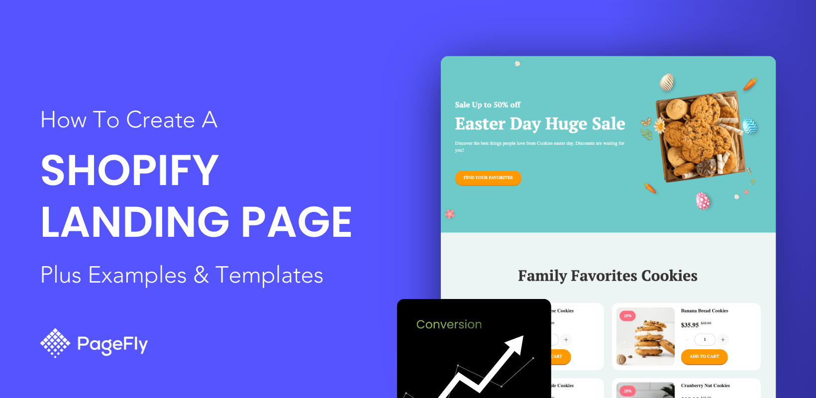
For example. this PageFly's Easter landing page template features bold “50% Off” banners, countdown timers, and free shipping offers, creating sense of urgency and drive actions:

Webinar Registration Landing Page
Webinar registration pages are ideal for brands offering educational content or live demos that engage audiences while capturing attendee details. By that, businesses can easily monitor and manage the numbers of registration and attendee.
重要なヒント
- Highlight Event Benefits: Explain what attendees will gain from participating (e.g., exclusive insights).
- Use trust signals: add expert endorsements or testimonials from past attendees, the same proof pattern that lifts collection and category pages.

Example: An online coaching platform uses a webinar registration page with a single clear CTA (“Reserve Your Spot”) alongside testimonials from past participants, and nothing else on the page competing with the form.
Three ways to build a Shopify landing page (and when each makes sense)
There are three routes: Shopify’s built-in page editor and theme templates, custom Liquid code, or a page builder app. Choose the built-in route for a simple announcement, Liquid if a developer already owns your theme, and a page builder if the page has to look different from your theme and ship this week. For the full click-by-click walkthrough — section order, mobile checks and publishing — follow our dedicated guide on how to build a Shopify landing page that converts; what follows here is the trade-off between the three, so you can choose before you start.
Free Shopify Landing Pages: Built-in Method for Budget-Conscious Entrepreneurs
Perfect for solo entrepreneurs and micro businesses with limited budgets, Shopify’s built-in page creation costs nothing beyond your existing subscription — you are simply limited to the sections your theme ships with. This method works best for simple landing pages: “Coming Soon” announcements, basic lead capture forms and straightforward product promotions.
✅ Pros for new merchants:
- Completely free (no additional app costs)
- No learning curve for complex tools
- Automatically matches your theme design
- Built-in SEO fields — the same ones covered in our Shopify page SEO guide
- Mobile-responsive by default
❌ Limitations to consider:
- 限られたデザインのカスタマイズ・オプション
- No advanced conversion optimization features
- Cannot create complex layouts or animations
- No A/B testing capabilities
- Basic form functionality only
To create a free Shopify landing page using built-in tools, navigate to Online Store > Pages, add content with the theme editor, and fill in the SEO fields. If you have never used that part of the admin, our explainer on what Shopify pages are and how to add them covers it.
Steps by Steps Guide:
1. Create a new template in Shopify theme editor
 2. Design by inserting content using Shopify’s Theme editor (images, text, videos).
3. Add page by going to Online Store > Pages in your Shopify admin dashboard.
4. Click Add Page and enter a title for your landing page (e.g., “Holiday Sale”).

5. Save and publish the page, then link it to your store’s navigation menu.
*You can also set up page SEO information like page title, meta description, etc.
重要なヒント
- Use Shopify’s page editor: go to the “Pages” section in the admin to create a new page, then add text, images and video.
- Enable Contact Forms: Add Shopify’s built-in contact form for lead generation or customer inquiries.
- Optimize SEO Settings: Use the “Search engine listing preview” section to add meta titles and descriptions for better search visibility.
- Link pages strategically: connect the landing page to menus or promotional banners — or, for campaign traffic, to nothing at all, so the only way forward is your CTA.
- Keep the design simple and focused on a single conversion goal (e.g., email signups or product purchases).
- Use high-quality visuals and compelling headlines to grab attention instantly.
- Make sure you test page speed and performance before launching
Using Liquid Code (For Advanced Users)
To create or customize a Shopify landing page using Liquid code, you can go to Online Store > Themes > Actions > Edit Code in Shopify admin.
Why use this method? Liquid is Shopify’s templating language, and it lets advanced users customize themes and build highly tailored landing pages. It is only worth it if you have coding knowledge or a developer — the same trade-off we cover in our guide to Shopify product page customization methods.
Step by Step Guide:
- Go to Online Store > Themes > Actions > Edit Code in your Shopify admin dashboard.
- Locate the “Templates” folder and open the relevant file (e.g., page.landing-page).

- Add custom Liquid code to modify layout or insert dynamic elements like product recommendations or social proof widgets.
- Save changes and preview your landing page before publishing.
Pro Tips for customizing landing pages using code:
- Understand Liquid Syntax: Familiarize yourself with Liquid tags, filters, and objects for dynamic content creation.
- Back up your theme files: duplicate the theme before you change anything. If you are not sure which theme you are editing, our free Shopify theme detector will tell you.
- Add Custom Sections: Create unique sections like testimonials or countdown timers directly within the theme code.
- Test Responsiveness: Ensure your customizations work seamlessly across devices.
(*)注:Shopifyでは、テーマアーキテクチャのバージョンごとに分かれたテーマカスタマイズのチュートリアルを提供しています。 テーマアーキテクチャのバージョンを確認する方法.
Customize and Create Shopify Landing Pages With A Page Builder App
Shopify landing page builders like PageFly are the easiest and most flexible route; PageFly is used by 230,000+ Shopify merchants. These Shopify apps replace theme editing with drag-and-drop layout control and a library of conversion-oriented templates. If you want to weigh the options first, we compare them in our roundup of the best Shopify landing page apps.
PageFly holds a 4.9/5 rating from 5,658 reviews on the Shopify App Store, and sits between the two extremes: more design control than the native editor, no developer required. Our wider comparison of Shopify page builder apps explains where each one fits.
First, you must choose a suitable Shopify page builder app. To help you, we've analyzed the top 3 page builders in Shopify as follows:
Overview of Page Builder Apps
| アプリ名 | 主な特徴 | 最適 | 価格 | 評価 |
|---|---|---|---|---|
| ページフライ |
| Beginners and advanced users seeking flexibility | Free plan available; paid plans start at $24/month | 4.9/5 (5,658 reviews) |
| 将軍 |
| Merchants focused on performance tracking and engagement | Paid plans only — check the current App Store listing | See the current App Store listing |
| ジェムページ |
| Brands prioritizing visual appeal and conversions | Free plan plus paid plans — check the current App Store listing | See the current App Store listing |
Once you have chosen a page builder — the trade-offs between the main ones are in our Shopify landing page app comparison — here is how you actually build and edit the page.
We use PageFly for the walkthrough below. Its free plan lets you publish 1 page or section, includes 10 AI credits a month, and gives you access to all 320+ page & section templates — enough to test one campaign before you pay anything.
ステップ1: PageFlyランディングページビルダーのインストール
Install PageFly from the Shopify App Store, then open it from アプリ in your Shopify admin. If you would rather compare it against the alternatives first, start with our list of Shopify landing page apps.

Step 2: Create Shopify landing pages with PageFly
Shopify管理画面のサイドバーで、Apps > PageFly - Advanced Page Builderをクリックします。その後、別ページのPageFlyダッシュボードにリダイレクトされます。

ページフライアプリのページダッシュボードで、ページを作成するか、左メニューの(+)アイコンをクリックします。その後、ページ設定でお好みのページタイプを選択できます。

PageFly provides page types built for Shopify landing page work: home, product, collection, about, lead capture and seasonal campaign pages. This Shopify page builder works on top of your existing theme, and its visual editor gives you layout control the default page editor does not have.
After configuring your landing page settings, you reach PageFly’s template library — 320+ page & section templates, including Shopify landing page templates grouped by industry and campaign goal. You can browse the same library of landing page templates for Shopify before installing anything.

しかし、ゼロから物事を作り始めたい場合は、白紙のページで作成を選択することができる。

ステップ3:エレメントの追加
The page editor gives you PageFly and Shopify elements and sections to drag onto the blank page, so you can structure the layout however the campaign needs it — including patterns borrowed from your homepage or your collection pages.

PageFlyはまた、エレメントを使った無限の実験を提供します。
A faster approach is to start from one of PageFly’s 320+ page & section templates in page settings and delete whatever your campaign does not need.
PageFlyでShopifyのランディングページを作成する方法については、こちらのチュートリアルをご覧ください:
ステップ4:ページのプレビューまたは公開
ページの作成が終わったら、「保存」をクリックします。このオプションはページをデータベースに保存しますが、まだ公開はしません。プレビューでページのプレビューを見ることができます。
The Publish button both saves the page and makes it public, and Live View shows it at “your-shop-name.myshopify.com/pages/page-name”. Before you publish, fill in the page title and meta description — our Shopify page SEO guide covers what to write in them.
You can find the PageFly page in Shopify itself under Shopify home > Sales Channels > Online Store > Pages, alongside every other one of your Shopify pages.
Shopify landing page templates: which one to start from
The fastest way to create a landing page in Shopify is to start from a template and remove what the campaign does not need. PageFly’s library holds 320+ page and section templates — you can browse them on the PageFly templates page — and the free plan gives you access to all of them with 1 published page or section.
Filtering the library by page type is faster than scrolling it: the Page tab lists 129 page templates, and selecting Landing page narrows them to 29. The same filter covers Homepage (46), Product page (27) and Collection page (8), so you can open the PageFly template library and go straight to the set that matches the page you are building.
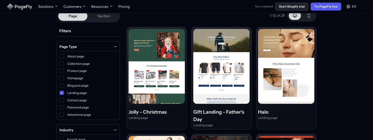
Use the table below to pick a starting point against the four constraints that usually decide it: the campaign type, the skill level required, what it costs, and how quickly it can be live.
| Starting point | Best for (campaign type) | Skill level needed | コスト | Time to live |
|---|---|---|---|---|
| Cookie Easter template (PageFly) | Holiday and flash-sale campaigns with a countdown | None — drag-and-drop | Free plan covers 1 published page or section | Same day — the layout is already built |
| SmartNest Mother’s Day template (PageFly) | Gift-led occasion campaigns | None — drag-and-drop | Free plan covers 1 published page or section | Same day |
| Any of PageFly’s 320+ page & section templates | Product launches, lead capture, sales pages, seasonal offers | None — drag-and-drop | Free plan (1 page or section, 10 AI credits/month); Builder $24/month for more | Same day |
| PageFly blank page | Brand-specific campaigns no template matches | Comfortable with a visual layout tool | Same plans as above | Hours rather than minutes |
| Shopify built-in page + theme template | Coming-soon pages, simple announcements, basic lead capture | None, but you are limited to your theme’s sections | Included in your Shopify plan | Same day |
| Custom Liquid template | Bespoke pages tied to theme logic or custom data | 開発者 | Depends on your developer’s rates | Days to weeks, depending on availability |
The two seasonal templates in that table are covered in detail below. Both are the clearest illustration of the principle: they win by leaving things out.
| Template Name | 主な特徴 | 最適 | 価格 |
|---|---|---|---|
| Cookie Easter | Festive design, countdown timer | Seasonal promotions | Free with PageFly |
| SmartNest Mother’s Day | Elegant visuals, urgency elements | Holiday campaigns | Free with PageFly |
Cookie Easter Shopify landing page template - Built by PageFly
The Cookie Easter Shopify landing page template, built with PageFly, is a visually engaging and conversion-focused design tailored for seasonal promotions.

The landing page excels in seasonal design, incorporating vibrant colors, Easter-themed visuals, and playful typography that immediately resonate with the holiday spirit. This creates an emotional connection with visitors and aligns perfectly with the theme of the promotion.

The layout is clean, with ample whitespace that emphasizes key elements like product images, discounts, and countdown timers. These features create a sense of urgency and focus attention on the promotional offer.
Additionally, the page is mobile-optimized, ensuring a seamless browsing experience across devices. Its use of high-quality visuals and concise copy enhances user experience while maintaining fast loading speeds.
By combining festive design elements with effective CTAs and responsive functionality, this landing page template successfully captures visitor attention and drives conversions.
SmartNest Mother’s Day Shopify Landing Page Template - Built by PageFly
The SmartNest Mother’s Day Shopify landing page template, built with PageFly, is a compelling example of a seasonal landing page designed to drive holiday sales. Its success lies in its strategic use of festive design, clear messaging, and effective call-to-action (CTA) placement.

This landing page captures attention with its Mother’s Day-themed aesthetic, featuring soft colors, elegant typography, and heartfelt visuals that resonate emotionally with visitors. The design creates an immediate connection with the holiday spirit, making it highly engaging.

The page emphasizes urgency through countdown timers and stock scarcity messages like “Only X left in stock!”, encouraging quick purchases. Additionally, discounts and free shipping offers are prominently displayed, making the value proposition irresistible to customers.
The layout is clean and mobile-optimized, and every breakpoint stays editable in the PageFly visual editor. By combining emotional appeal with a clear CTA and honest urgency, the template does the seasonal job without extra sections.
5 Shopify landing page examples, broken down
Other Shopify stores are the fastest source of ideas for your own landing pages.
We looked at as many Shopify pages as we could find — home pages, product pages, thank you pages — and picked the five below because each one does a single thing unusually well. For page-type-specific breakdowns, see our libraries of Shopify homepage examples and best Shopify product pages.
Skin Discovery Reward Landing Page (built with PageFly)
The Skin Discovery Rewards landing page, built with PageFly, excels in engaging visitors and driving conversions through its loyalty program. Its success lies in its clear structure, user-focused incentives, and seamless navigation.

The page excels at one thing: the value proposition is legible immediately — what you earn, and for which actions (purchases, referrals, social engagement). Nothing above the fold explains the brand instead.
The use of varied incentives, such as earning points for actions like following on Instagram or sharing referral links, appeals to different customer behaviors and encourages interaction beyond purchases.

Additionally, the clean layout and strategic placement of CTAs, such as the SIGN UP button and rewards widget, make navigation intuitive and action-oriented. The design is mobile-optimized and visually appealing, with bold headings and ample whitespace that emphasize key elements without overwhelming users.
This landing page succeeds because it combines a customer-focused strategy with a professional aesthetic. By offering monetary rewards for simple actions and making it easy for users to participate, it fosters engagement and builds loyalty. Its seamless navigation and retention-driven features, such as personalized referral links and loyalty points, further enhance its effectiveness.
Shopify's Free Trial Landing Page: Advanced Conversion Strategy Analysis
Let's start with the closest example to hand: Shopify's own.
Shopify’s free trial landing page is a useful teardown for scaling D2C brands precisely because it does so little: one offer, one action, and no secondary navigation competing with it.
Conversion Strategy Breakdown:
- Single CTA focus: Only one action ("Start free trial") eliminates decision paralysis
- Strategic CTA placement: Hero section for ready buyers + bottom placement for those needing convincing
- Progressive disclosure: Information revealed gradually to maintain engagement without overwhelming visitors
- Trust signal integration: Customer logos, security badges, and social proof positioned at decision points
Why this works for scaling brands:
- Reduces cognitive load: Visitors process one clear message instead of competing offers
- Removes the exits: with no navigation menu and no secondary offer, the only forward path is the CTA
- Optimizes for different buyer stages: Immediate CTA for hot leads, educational content for cold traffic
- Scalable template: This structure works for product launches, seasonal campaigns, and lead magnets
💡 Actionable takeaway for your store: apply this repeated-CTA pattern to your highest-value landing pages — primary button in the hero, the same button again after your main value proposition — then confirm it with an A/B test rather than assuming.

Flow - Seasonal Landing Page Example
Flow runs seasonal landing pages built around beekeeping tips, which lets them target different visitors through the year instead of pointing every campaign at the same collection page.

位置情報をカスタマイズできるヘッダーバーによって、Flowは世界中の顧客との距離をさらに縮めることができる。以下は、完璧なテスティモニアルとして使用されたケーススタディです。
スクロールするたびに、情報セクションと魅力的な行動喚起ボタンが表示される。いくつかの行動喚起や表現があるにもかかわらず、メッセージや目標は一貫している。
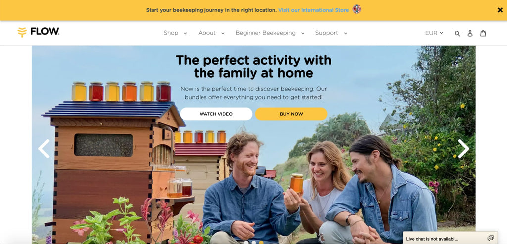

画像の使用はフローの重要な武器である。日常的に使用されている商品の生き生きとした写真を見せることで、消費者と自然物とのつながりを強調している。さらに、照明も実に的を得ている。
Luxy Hair
Luxy Hair sells hair extensions made from human hair. Because the product has a lot of variants, the shopper is walked toward the right one — thickness first, then color, then a few more quiz-style questions — instead of being handed a variant grid. It is the landing-page equivalent of good filtering, which we cover in our guide to Shopify Search & Discovery.

一連の質問に答えると、買い物客は(理想的には)まさに探していたものを含む特定の商品ページにたどり着く。

The pop-up uses a discount to collect an email address, which feeds their personalization later. It is the same lead-capture trade covered earlier — ask for one field, give something back — and it is worth testing before you keep it.

お客様の声には、美容業界のビッグネームやお客様の写真が含まれています。信頼を築くには最高の方法だ!
Monk Manual
Half of Monk Manual’s thank you page is devoted to their referral program. It sets out every milestone a customer can reach and what they earn at each one, all the way to the final reward. Drawing the full progression on the page — instead of hiding it behind a link — is what makes people opt in.

Aside from referrals, Monk Manual adds social sharing buttons to the page, so customers who want to show off a new purchase become a distribution channel. It is a reminder that a post-purchase page is real estate, not a receipt — the same argument we make for the cart drawer.
Shopify landing page optimization: 5 fixes that move conversion
Shopify landing page optimization is mostly subtraction. Every element you keep has to justify itself against the one action the page exists for, so work through these five in order before you touch the headline.
- Remove the second exit. Strip the header menu, footer link blocks and any “you may also like” row from the template. Any link that does not serve the campaign is a way out of the page — keep browsing on your collection pages, where exploration is the goal.
- Cut the form to the fields you will actually use. Each field you delete removes a reason to abandon. Ask for the email now and collect the rest after the conversion.
- Repeat one CTA instead of adding a second offer. Use the same button in the hero and again after your main proof block — exactly what Shopify’s own free-trial page does above.
- Move proof next to the decision. Reviews, guarantees and trust badges belong beside the button, not in a testimonials section at the bottom that most visitors never reach.
- Trim page weight before you tune copy. Oversized hero art and unused app scripts cost more than wording does. Export images at the correct dimensions using our Shopify banner size cheat sheet, and remove anything the page does not need.
Then change one thing at a time. Shopify A/B testing tells you which version wins; our data on the average Shopify conversion rate tells you whether the winner is actually good.
If discovery rather than conversion is your bottleneck — people arriving and not finding the offer — that is a different fix, and our guide to Shopify Search & Discovery is the better starting point.
結論
Start Creating High-Converting Shopify Landing Pages Today
Shopify landing pages work because they narrow the choice, not because they add features. Whether you use Shopify’s free built-in pages for a simple campaign or a landing page builder like PageFly for full design control, the point is to ship one, measure it, and remove what is not pulling its weight.
Your next steps:
- Choose your method: built-in Shopify pages for basic needs, or a page builder app for template-led design control
- Start with one high-impact page: Focus on your best-selling product or highest-value lead magnet
- Test and optimize: use A/B testing to improve conversion rates continuously
- Scale what works: Apply successful elements across multiple landing pages and campaigns
Remember: dedicated landing pages pay off most for campaigns, product launches and paid traffic sources — places where the visitor arrived with one intention. PageFly’s free plan covers 1 published page or section with access to 320+ templates, which is enough to test the idea properly. If you want the build steps, start with how to build a Shopify landing page that converts.
Ready to build your first Shopify landing page? See how the PageFly visual editor works, or browse the 320+ page & section templates before you commit to anything.
ShopifyランディングページFAQ
Yes. You can build a landing page in Shopify three ways: with the built-in Pages section and your theme's sections, with custom Liquid code, or with a page builder app such as PageFly, Shogun or GemPages that adds drag-and-drop layout control and a template library.
The difference is purpose. A landing page is built for a single conversion goal with the distractions removed, while a regular Shopify page (homepage, product page, collection page) serves several purposes and encourages browsing. Landing pages usually drop the navigation menu and keep one repeated call-to-action; regular pages keep full navigation and multiple paths.
The five broken down in this article are Skin Discovery Rewards (built with PageFly), Shopify's own free-trial page, Flow's seasonal pages, Luxy Hair's quiz-led page and Monk Manual's referral thank you page. Each one wins on a single thing rather than many: a legible offer, one repeated CTA, a location-aware header, a quiz that narrows choice, or a visible referral ladder.
Optimizing a Shopify landing page is mostly subtraction. Remove the header menu and footer link blocks, cut the form down to the fields you will actually use, repeat one CTA instead of adding a second offer, move reviews and guarantees next to the button, and reduce page weight before you rewrite copy. Then change one thing at a time and A/B test it.
There are three routes:
- Built-in: Online Store > Pages > Add page (free, limited to your theme's sections).
- Liquid code: edit the theme template directly (developer required, full control).
- Page builder app: install PageFly or similar and start from a template (fastest, no code). Our guide on how to build a Shopify landing page covers the steps in full.
Shopify's own theme templates are free but limited in design. PageFly's free plan gives you access to all 320+ page and section templates, 10 AI credits a month, and 1 published page or section; to publish more, paid plans start at $24/month (Builder).
Yes. Custom Shopify landing pages can be built with Liquid code for complete control, or with a page builder such as PageFly for visual customization without coding. Either way you can tailor the page to a specific campaign, product or customer segment.
A landing page focuses on a single conversion goal (email signup, purchase, download) with the distractions removed, while a product page shows product details inside your store's normal navigation. The landing page is built for one campaign; the product page has to work for every visitor who finds it.
It depends on the route you choose:
- Shopify's built-in pages: no extra cost beyond your Shopify plan, but you are limited to your theme's sections.
- A page builder app: PageFly has a free plan (1 page or section, 10 AI credits a month, 320+ templates); paid plans start at $24/month (Builder).
- Custom development: a one-off cost that depends entirely on your developer's rates.